Keep up-to-date with drugs and crime

The latest research, policy, practice and opinion on our criminal justice and drug & alcohol treatment systems
Search
Differential sentencing
The MoJ's interactive Sankey diagram allows anyone to see the changes in sentencing trends and the differences in sentencing by age, gender and type of offence.

Share This Post

Sentencing and criminal history

The most recent (15 February 2018) Criminal Justice Statistics Quarterly bulletin (covering September 2016 – September 2017) confirms recent key trends — the lowest number of people since modern records began (1970) were dealt with by the courts, but the proportion of people imprisoned for indictable offences rose again and that average length of sentence increased too. Here are the main points as summarised by the bulletin:

Introducing Sankey

Since the trend, and the underlying reasons for it, have remained the same for the last two or three years, I decided I would do something more interesting with this post than just give you chapter and verse on the headline developments in more detail.

Instead, I want to introduce you to a fabulous resource from the Ministry of Justice: their interactive  Sankey diagram which lets you see how groups of people’s offending history is reflected in how the courts sentence them.

In case you don’t know (and I certainly didn’t) Sankey diagrams display flows and their quantities in proportion to one another. The width of the arrows or lines are used to show their magnitudes, so the bigger the arrow, the larger the quantity of flow. Flow arrows or lines can combine together or split through their paths on each stage of a process.

The MoJ Sankey diagram allows you to focus on a particular group of offenders by age or gender and/or a particular type of offence and lets you see instantly how the criminal justice system sentences them. 

You can all see differences in sentencing on a yearly basis going back to 2007.

The diagram is delightfully intuitive and engaging and I spent a happy half hour trying out all the permutations. 

It’s important to remember the limits of what the diagram can tell you. For instance a larger proportion of women than men receive a suspended sentence for sexual offences (while immediate custody rates are similar) and while a very small proportion of men are dealt with by an absolute discharge, no women receive this court disposal. However, the profile of sexual offending by men and women is different, so you are not necessarily comparing like with like.

Nevertheless, there’s much to be learned by this interactive approach and you can see why some say:

A Sankey diagram is worth a 100 pie charts.

I hope you find the examples I’ve chosen interesting and, more importantly, you will go and try out the resource yourself.

Adult men sentenced for sexual offences

Adult women sentenced for sexual offences

Sentencing 2007-2017

The next two slides show the difference in the overall sentencing patterns for juvenile and adult offenders between 2007 and 2017.

You can immediately see the rise in the use of immediate custody and the fall in the use of both cautions and community sentences.

Sentencing for all crimes 2007

Sentencing for all crimes 2017

Share This Post

Related posts

Criminal Justice
Drive to increase judicial diversity

Online learning platform to enable candidates from all legal backgrounds to maximise their chances of becoming a judge.
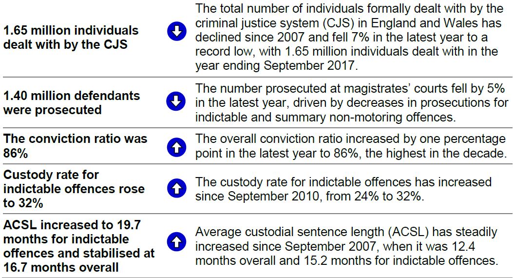
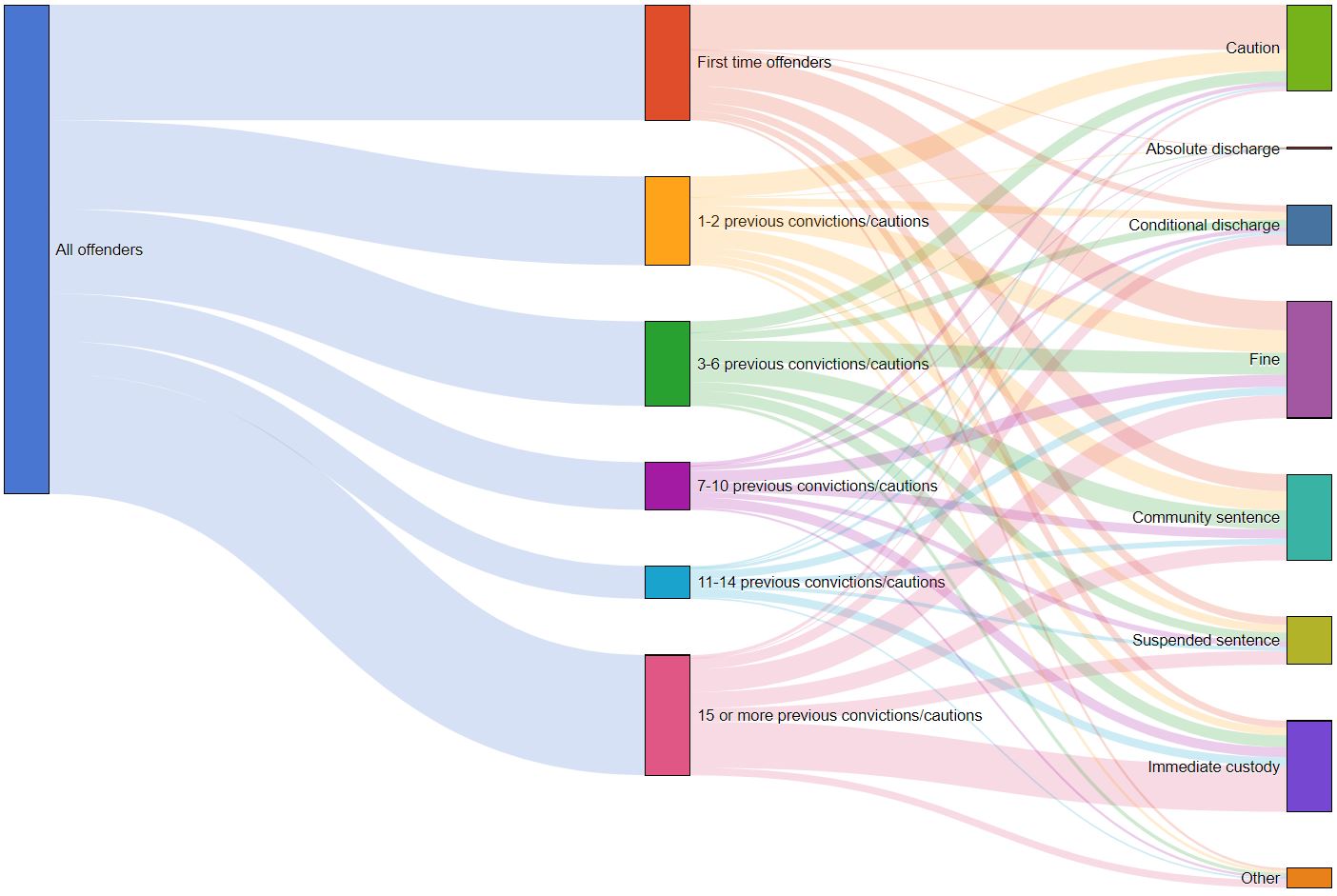
Leave a Reply

Your email address will not be published. Required fields are marked *

Subscribe

Get every blog post by email for free